Uber, Robinhood, Airbnb, and PayPal are drastically different companies but have one thing in common-they grew exponentially because of their referral programs. They used their referral programs to create a sense of camaraderie among their users, foster a sense of exclusivity (and thus importance), and create viral loops online.
Referral images, images seen in referral pop-ups and emails that tell users that they can get an incentive for referring people to your brand, were created to make sure that users know about your referral program and talk about your products or solution.
Thoughtfully designed referral images backed by great referral programs are more likely to get conversions. If your referral program needs a boost, check out how other companies are doing it right.
1. Lull – Encourage Gift-Giving with Discounts for Referrals
Lull, a mattress company, knew the power of word-of-mouth marketing and customer advocacy, but because Lull is a mattress company, happy customers don’t mean more sales and conversions; happy customers mean no repeat sales for the next 15 years.
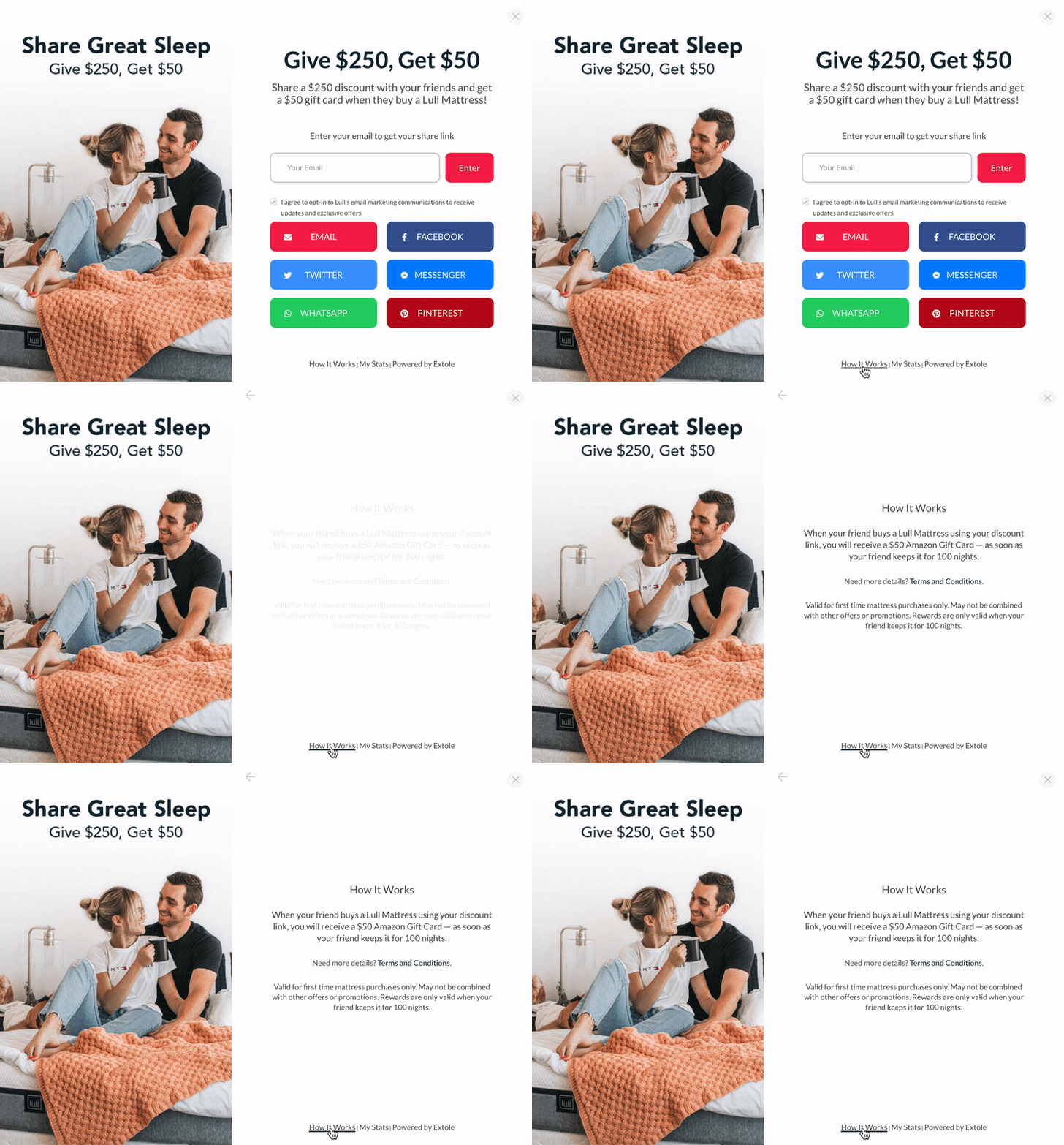
[source] Lull’s comprehensive referral program pop-up design
This is why its referral program was a bit different-it incentivized customers to refer their friends using a smaller incentive and then doubled down on asking the friends to buy with a larger incentive. In addition, it made sure it had an eye-catching referral image pop-up that clearly defined its referral program mechanics. It even added social sharing buttons to the pop-up to make it easier for referral sources to tell their friends about Lull.
Lull’s referral program was so successful that it had a 9% conversion rate, and of those conversions, 7% became referral sources themselves.
What We Can Learn From Lull
Build a referral program that aligns with your overarching goal. Because of the nature of Lull’s product, it needed referral sales (i.e., sales from people who were referred to your brand), not repeat sales. Therefore, it built its program to reflect that goal.
2. BESTSELLER – Language Localization Encourages Engagement
Unlike Lull’s mattresses, clothes are fast-moving consumer goods (FMCG), so BESTSELLER’s referral pop-up design and program focused on encouraging both existing customers and their referrals to buy more clothes-both parties got a $30 discount.
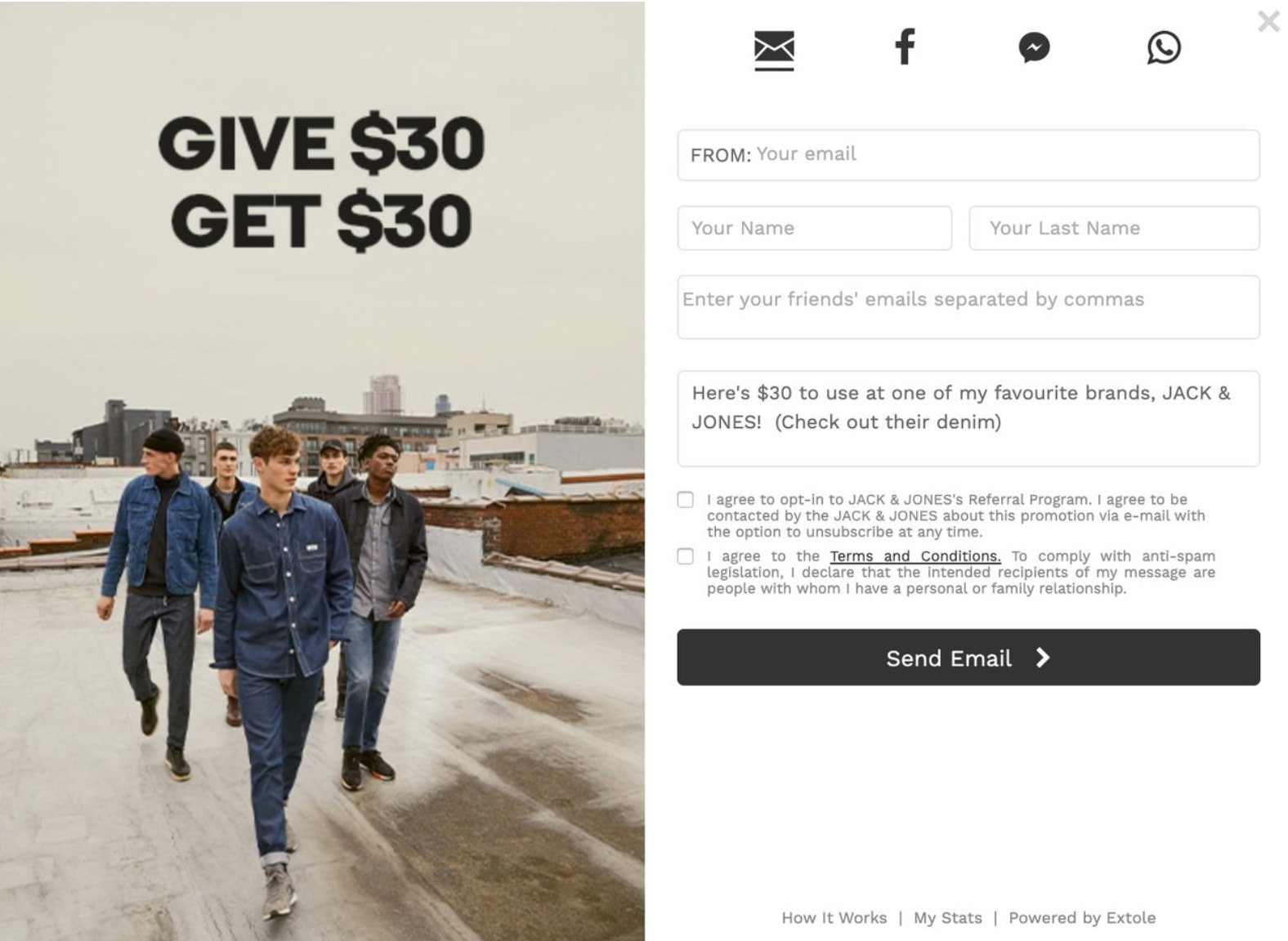
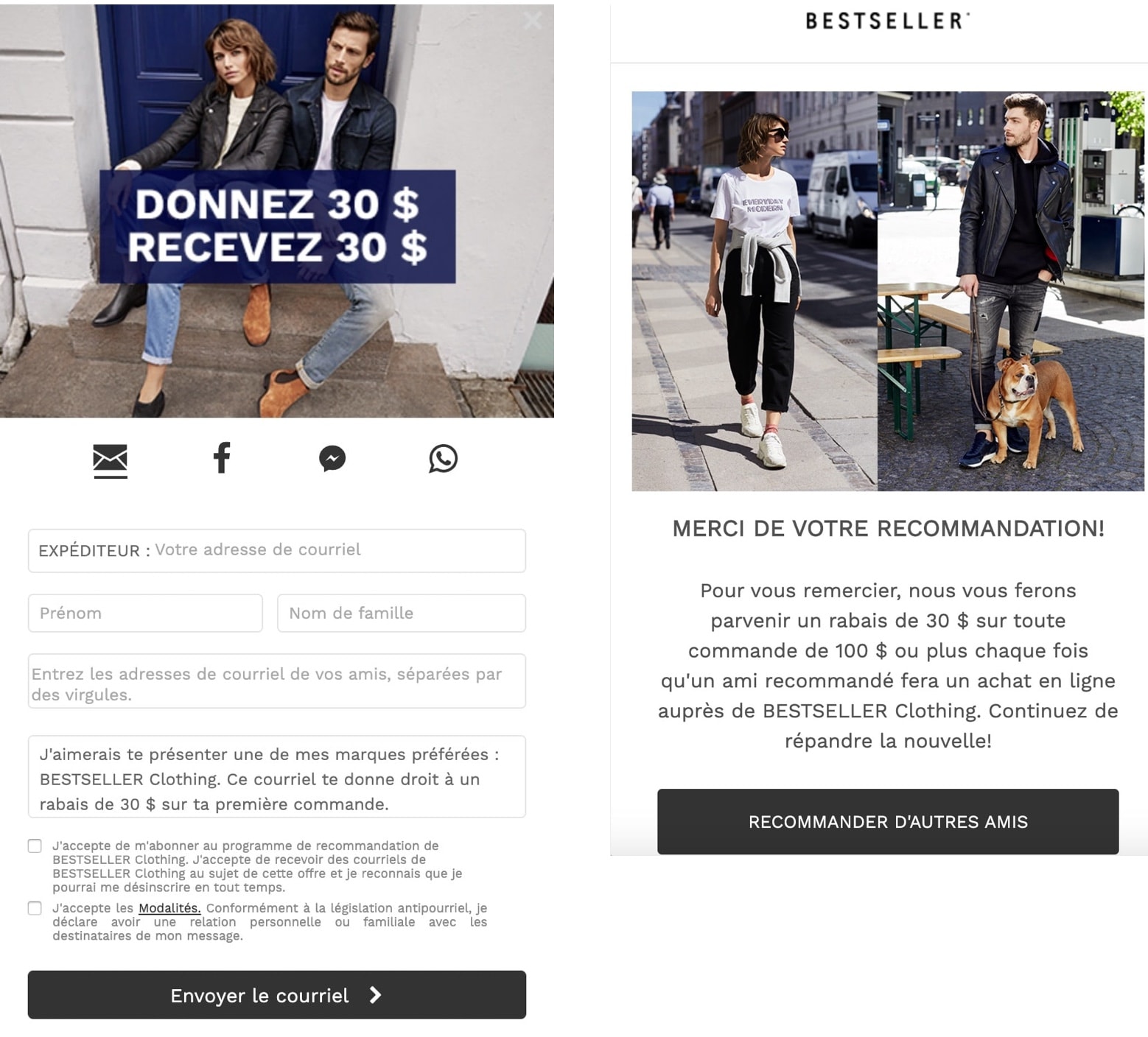
[source] BESTSELLER’s desktop and mobile referral images, in French and English
BESTSELLER knew that its customers were all across North America, a culturally diverse continent that spoke many languages, so it used software to easily create referral pop-ups in the region’s top three spoken languages: English, Spanish, and French.
Its referral program was tremendously successful, attracting 35,000 website visitors and turning 31% of its North American customers into advocates.
What We Can Learn From BESTSELLER
Language localization goes a long way in turning your customers into advocates. Rather than use English across the North American continent, BESTSELLER decided to build its referral images in that region’s top three most spoken languages.
3. Perricone MD – Keep Your Referral Program Fresh
Perricone MD, a health and beauty company, has a regular referral program but keeps its program top of mind by running referral promos. During referral promos, it changes incentives, often highlighting products it knows its customers love. Then it creates a sense of urgency with a four-day deadline.
Keeping its referral program fresh more than doubled its advocacy rates and octupled its conversion rate.
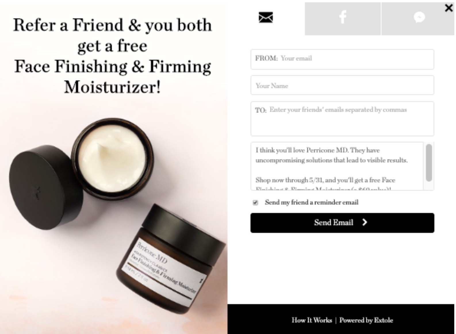
[source] Perricone MD’s referral image design for its burst promo
What We Can Learn From Perricone MD
Perricone MD kept its referral program relevant by changing it up every now and then and understanding what products its customers want. It used referral marketing software to switch between programs easily and quickly.
4. Xoom – Locally Relevant Programs Succeed
Xoom is a global remittance company that built its referral program to change based on its customers’ locations (i.e., if you’re in Korea, you get your referral bonus in Korean Won instead of U.S. Dollars).
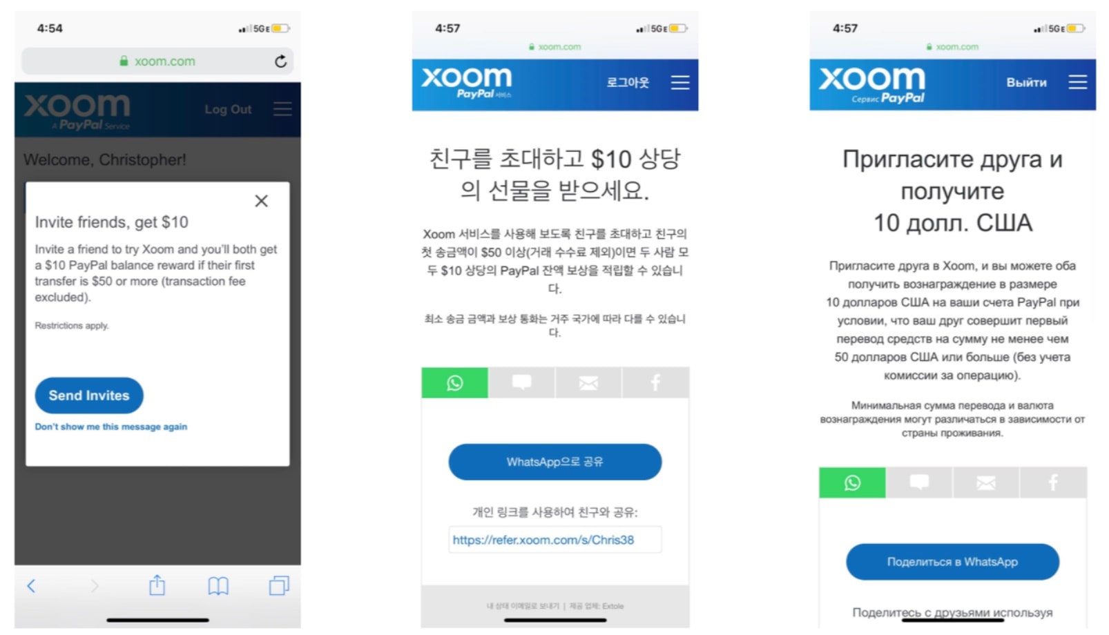
[source] Xoom’s referral program appeared in different languages, depending on where its customers were
Even though Xoom is a global company, it wanted to connect with its customers on a local level. So it used software to automate language localization, which helped to scale its referral program, increasing its number of advocates by 6,000 per month and improving performance by 75%.
What We Can Learn From Xoom
Consumer needs are different across the globe, so localizing your program’s language and incentives will help you align better with their mindsets.
Referral Marketing – The Best Practices You Need to Know
Written by veteran referral marketers, this guide will help you optimize your referral marketing program and supercharge growth.
Get the Guide5. Amerisleep – Make Sure Your Referral Image is Visible
Amerisleep’s pop-up design and referral program were simple but effective. It used both a pop-up and banner on its homepage footer to tell people that it had an existing referral program.
Unlike Perricone MD, Amerisleep’s referral image focuses on the incentive by placing it in the forefront, in large text. The product is in the background because referral sources are probably not in the market for another mattress.
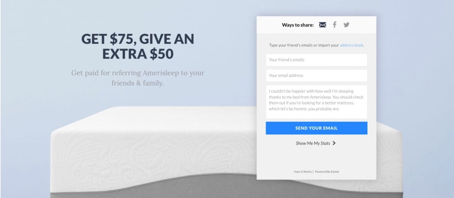
[source] This is Amerisleep’s referral pop-up
What We Can Learn From Amerisleep
Amerisleep made sure that its referral program was visible by creating a pop-up and adding it to its homepage’s footer. But it did so in an unintrusive way. It kept its referral program top of mind while also ensuring that it wasn’t disrupting the user experience.
6. TaxAct – A/B Test Your Referral Image Pop-up Design and Incentives
TaxAct’s referral program is simple: Find people who are referring its brand and getting a lot of sign-ups, and create the perfect program for them.
It used historical data to determine what kind of program its customers wanted. TaxAct A/B tested different rewards and reward levels it wanted to test out, then used referral program software to test different images and messaging. From its research, it was able to create a Super Advocate program.
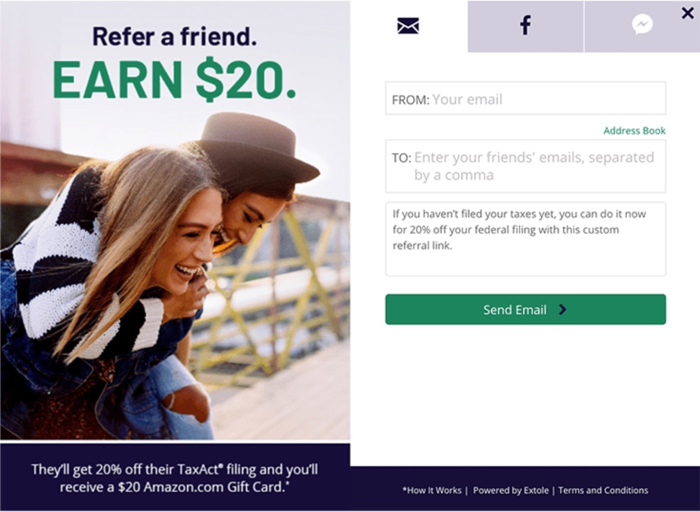
[source] This is one version of TaxAct’s referral pop-up
TaxAct created a program with a 32% conversion rate because it looked into what its customers wanted and changed its program accordingly.
What We Can Learn From TaxAct
Your customers are your referral sources-let them determine what your referral program should look like.
7. Ulta Beauty – Show Your Existing Customers How Much You Appreciate Them
Ulta Beauty has over 19 million active customers. It identified which of its customers were advocates and built a referral program that showed appreciation for them. And the language on its referral image clearly shows that: “It’s about time beauty loves you back.”
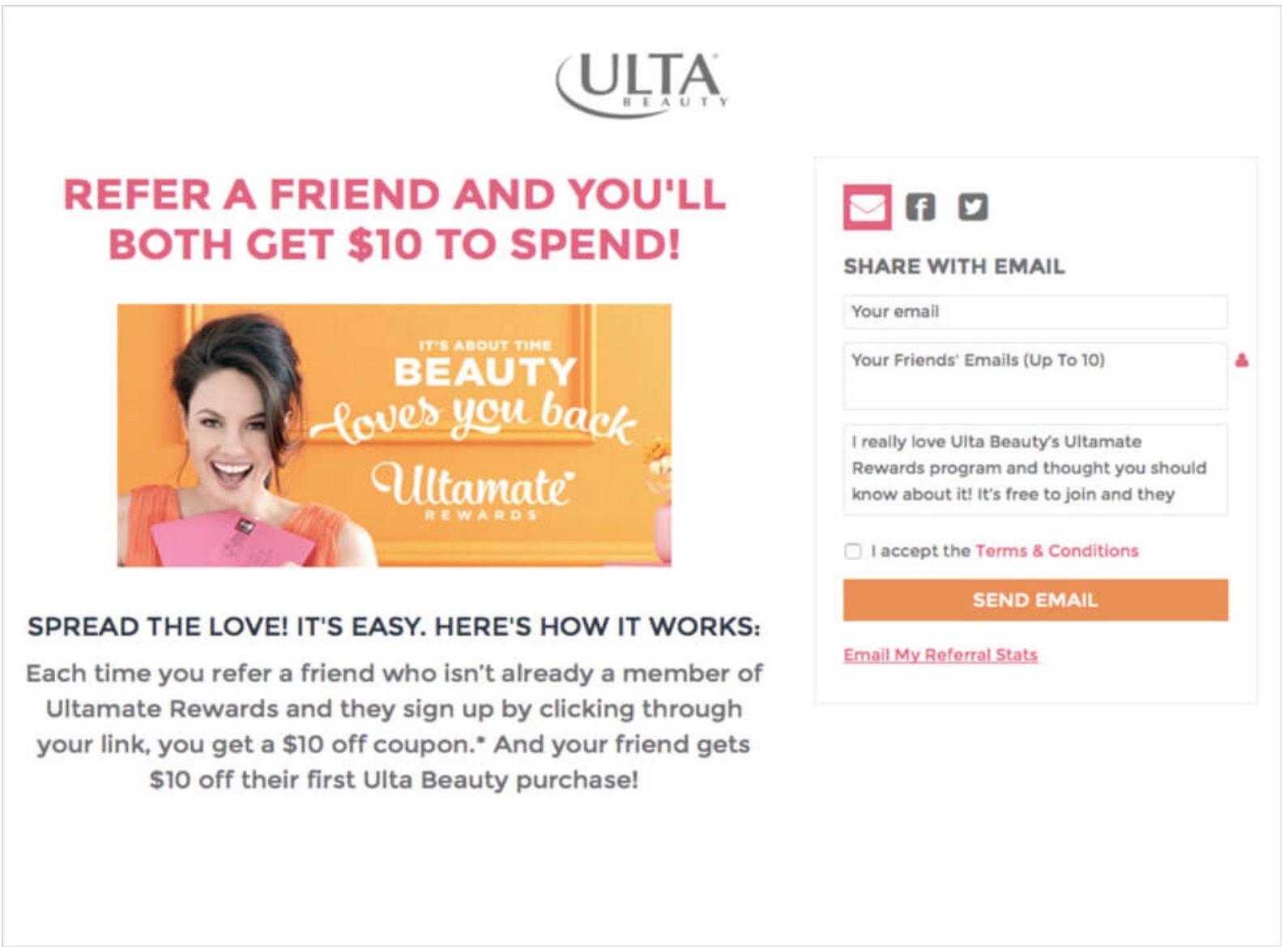
[source] Ulta Beauty gives back to its customers
The goal of Ulta Beauty’s referral program wasn’t to generate sales; it was to get people to join its community. Communities are great ways to keep in touch with your customers and make sure they’re getting all the latest news about your brand-from promos to new products-which in the long run can generate more sales.
What We Can Learn From Ulta Beauty
Show your customers that you appreciate them using your referral image and program to increase customer loyalty. Customers who feel underappreciated are more likely to switch to a brand that values them more.
8. Hanna Andersson – Re-engage Your Dormant Customers with a Referral Program
Hanna Andersson used its “give 20%, get 20%” referral program to re-engage customers who haven’t purchased from it in a while.
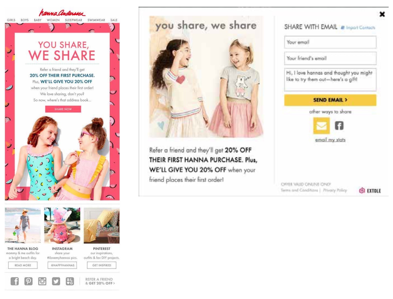
[source] Hanna Andersson distributed its referral image through email and within a pop-up to re-engage dormant customers
Hanna Andersson distributed its referral image through email to customers on its list who haven’t interacted with it recently. It also had a website pop-up for active customers and new visitors.
What We Can Learn From Hanna Andersson
If you have a long email list of customers who haven’t interacted with your brand in a while, re-engage them with a referral program and tap into their circles while doing it.
9. Julep – Remember that Exclusivity Breeds Loyalty
Julep created an exclusive circle for its top customers called the Maven Program.

[source] This is Julep’s Maven Program, which is designed to improve customer loyalty
Julep got five times the number of shares because of its referral program and the community behind it.
What We Can Learn from Julep
Exclusivity and fostering FOMO (fear of missing out) have been used in marketing for a while now because those tactics work. For example, Julep created an exclusive community that got perks and incentives, making them feel like they were part of something. Creating a community to support your referral program is a great way to get the ball rolling on your word-of-mouth marketing.
10. American Giant – Develop a Product That People Can’t Help But Share
American Giant encouraged customers to share its brand, then collected data on customer preferences. Next, it monitored its analytics dashboard to figure out why its customers were sharing and kept optimizing its program to fit those preferences.
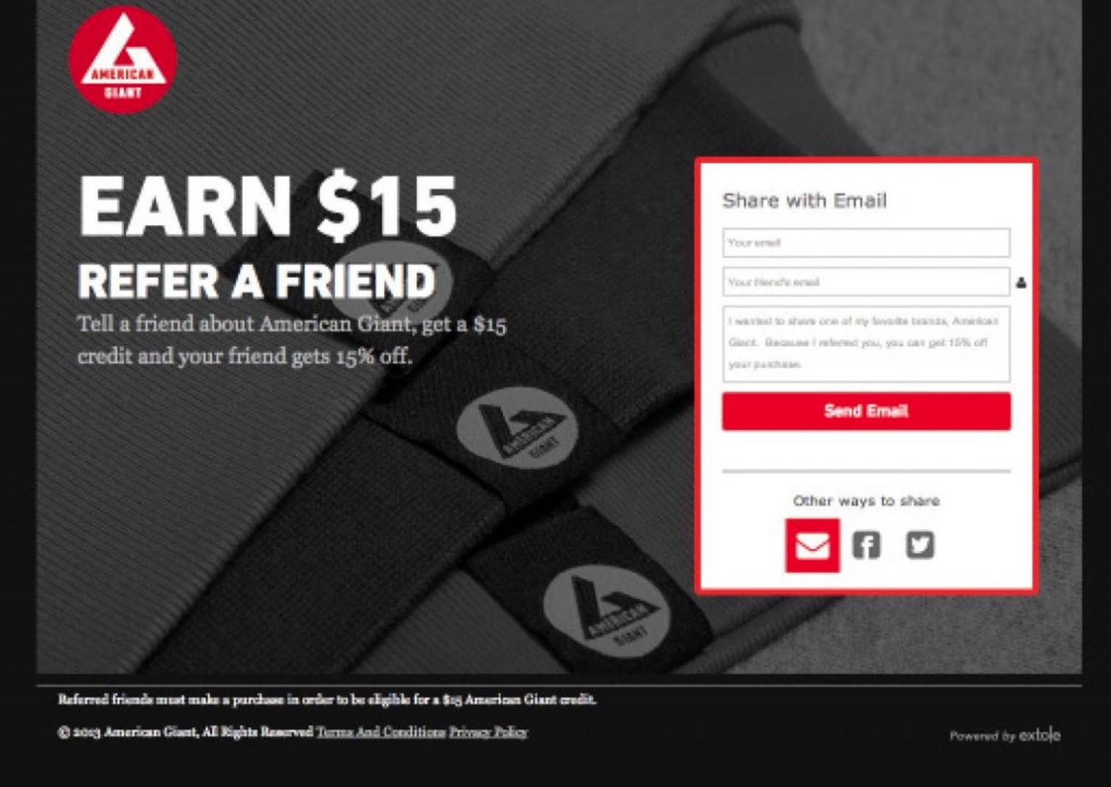
[source] American Giant made sure its referral pop-up aligned with its branding
But at the heart of its referral program was its product. It made a high-quality product that people loved and were willing to share with their friends.
Its referral program was so effective that it drove 10% of its e-commerce transactions.
What We Can Learn from American Giant
Create a product that your customers want to talk about-incentive or no. American Giant’s referral program isn’t special on its own. People were already talking about the brand because they loved the products. The referral program just boosted the existing word-of-mouth marketing and made it even more viral.
Boost Word-of-Mouth Marketing With a Great Referral Image and Program
Referral programs are more than just a way for customers to share your brand; they’re also a way for your company to build connections with your advocates and back to them.
And for your program to work, you need to design it in a way that speaks to those advocates, gives them an incentive that they want, and keeps those advocates coming back to your brand. For that, you need a referral image pop-up that contains your program guidelines and some social buttons to make sharing easier.
Create the perfect referral program for your advocates, no matter where they are, using Extole’s Refer-a-Friend Program.
