On the surface, A/B testing your website or app looks incredibly simple. All you do is send half your users to Variation A, half to Variation B, and see which one drives more conversions.
But if you don’t have defined reasoning behind each test you’re running, hypotheses about the results, and concrete success metrics, you’ll get inconsistent results that don’t tell you anything actionable. A/B testing becomes truly powerful when you go into it with a clear vision of what you want customers to do, why they’re not doing it now, and ways to make them do it more in the future.
That’s why it’s such a powerful tactic for peer-to-peer marketing. For example, look at the refer-a-friend funnel below. There are quantifiable steps customers need to complete along the referral journey.
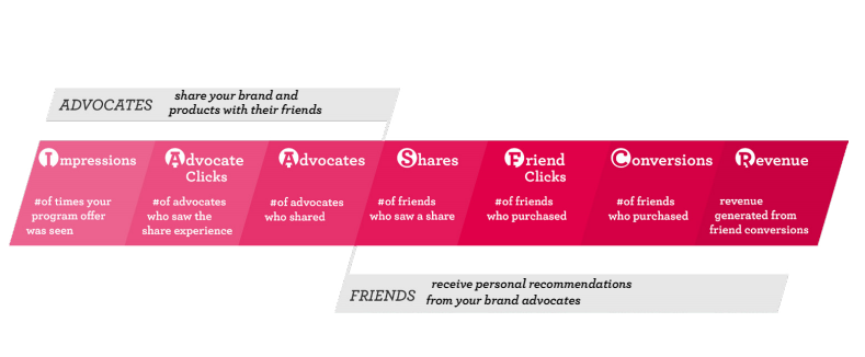
Within those steps are four crucial metrics. Each one is easily measurable and directly related to your referral program’s success, which makes them the perfect numbers to A/B test for:
- Advocate click rate. Impressions→Advocate clicks. The percentage of targets who click on a referral CTA and learn about the program.
- Advocate conversion rate. Advocate clicks→Advocates. The percentage of those people who share a referral and become advocates.
- Friend click rate. Shares→Friend Clicks. The percentage of people who click on the referral opportunity shared with them.
- Friend conversion rate. Friend Clicks→Conversions. The percentage of those people who accept the referral and purchase a product.
By getting granular and breaking refer-a-friend down into those core numbers, you can stay focused and quickly test even the smallest variations to improve them. That enables you to learn quickly, iterate often, and keep the program constantly improving. Here are the best A/B tests to optimize the referral journey.
Advocate Clicks
1. Referral Call-to-Action Location on Home Page

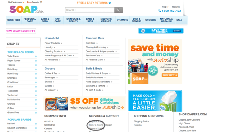
One of the most popular A/B tests is to put important CTAs in different places. It’s a great test for your referral CTA too. Let’s say you link to your referral program with a button on your upper navigation bar, similar to how American Giant does it above. Set up another version with the referral CTA at the bottom of the home page, like Soap.com below, and see which one gets more clicks.
2. Referral CTA Button Color

Image source
Test out different colors on your referral CTA. You might think that a small detail like the color of a button wouldn’t have much of an effect on conversion rates. But the evidence suggests that this simple change can have big effects. HubSpot was able to drive 21% more conversions for one of its clients by changing its free trial CTA button from green to red.
3. Email Subject Lines
When you send out emails touting your referral program, choose a sample of your users to A/B test different subject lines. Many Extole users have experimented with subject line variations that don’t mention their brand by name versus ones that do. But you should also try some more substantial tests with subject lines that have entirely different messages. Your email list is full of people who have actively chosen to hear about your promotions, so shooting them a message about your referral program is a no-brainer. Testing your subject lines helps you get the most out of it.
4. A/B Test Offline Referral Promotion

You should also A/B test physical ads promoting your referral programs. Try out different campaigns in areas you expect to get a similar number of eyeballs, and see which ones generate more traffic. You can easily measure by having each campaign direct customers to a referral landing page with a different URL.
Physical ads tap into everyday advocacy, which is a crucial referral marketing concept. Everyone who interacts with your brand, even if they haven’t bought from you, is a potential advocate. But only if they know they have the opportunity. You need to create as many opportunities as you can to promote your referral program as often as possible, and physical ads are a great way to do that.
Advocate Shares
5. Reward Size and Type
You might think that a bigger incentive would always drive more people to become advocates. But that’s often not the case. One of our clients found that a $10 gift card reward for advocates drove more referrals than $15 and $20 cards. Customers prefer referral because it feels like a favor for a friend, rather than a ploy to get free stuff, which is why smaller rewards often outperform bigger ones.
The type of reward matters too. We’ve seen product discounts trounce Amazon gift cards for some customers, and vice versa for others. The only way to know what will work for your unique audience is to get testing.
6. Landing Page Copy
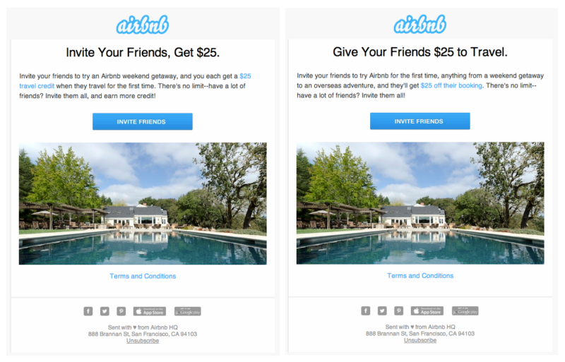
Image source
Try out different kinds of copy on your referral landing page. The way you frame referral can have a huge impact on how many of your targets become advocates. For example, Airbnb ran a test on the copy in emails it sent its customers promoting referral. Airbnb runs a double-sided program, in which both advocates and their friends receive $25 in credit. For the test, half their customers received an email emphasizing their reward, and the other half got one emphasizing the friend’s reward. They found that the more altruistic option won out.
7. Images on Referral Landing Page
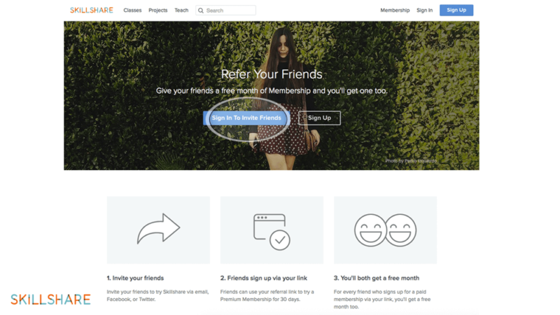
Another, simpler A/B test would just be to try different images on your referral program’s landing page. Check out Skillshare’s referral landing page above. They’ve opted to make the background a picture of a woman. Alternatively, they could test an image that more concretely connects the referral program to Skillshare’s value proposition, such as one of somebody taking a Skillshare class.
8. The Number of Ways to Share
Between email, SMS, and social media, you can offer advocates many different ways to share a referral. A/B test different combinations to see which one gets the most out of your advocates.
If you offer users too many sharing options, you won’t be able to optimize all of them. Kamo Asatryan, who’s grown several mobile apps through referral, says that most apps offer users too many options. That overwhelms users and takes up valuable real estate on the screen. He’s found that on mobile, two channels typically drive 80% of invites. Once you’ve figured those out, pour all your efforts into making them convert as much as possible.
Friend Clicks
9. Images in the Referral Share
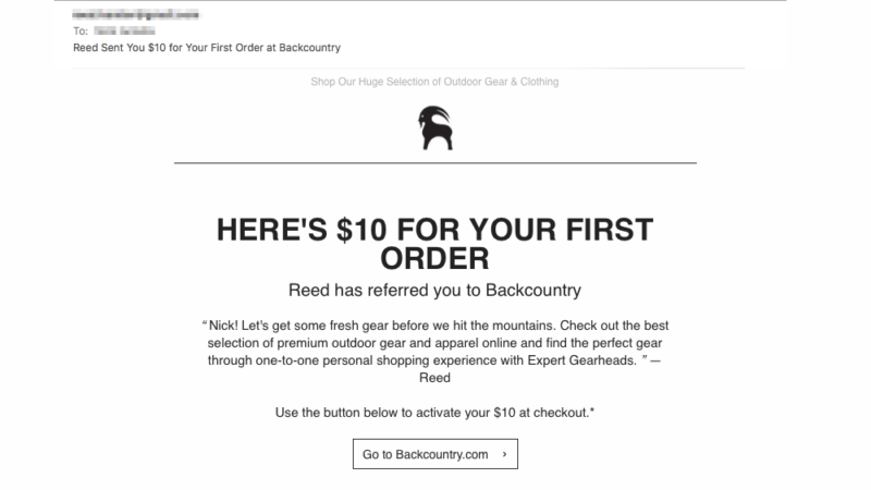
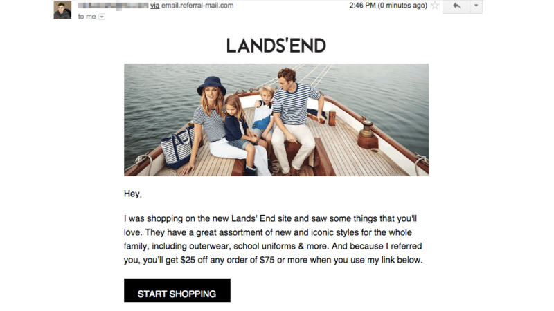
A/B test whether or not having images in the referral share message drives more conversions. Some companies, like Back Country, have opted for a simple referral message that uses mostly text. Others, like Lands’ End, lead off with an image. Test which one resonates most with your brand, and make sure you do it for other sharing channels like SMS and social media.
10. Amount of Information in the Referral Share Message
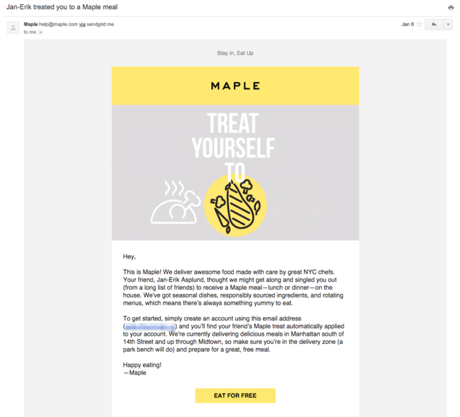
Similarly, you’ll also want to test how much you say about your product in your referral share. Check out the referral email above from NYC food delivery service Maple. They could A/B test an email that provides more information about where they source their ingredients from, since that seems to be a key differentiator for them.
Friend Conversions
11. Autocomplete
We always say that to make referral totally seamless, you shouldn’t force referees to create an account or fill out any information to get their reward. But if you’re a members-only e-commerce store, you might have to. If so, test what kind of conversion lift you get from autofilling any forms with as much of the friend’s information as you have, versus having them fill the entire thing out.
12. Guide New Customers Toward Specific Products
You can also test adding steps to the referral process that help customers find specific products they’ll like.
For example, makeup provider Julep offers a Maven program, through which participants can get a customized box of beauty products each month. When customers accept a referral to the program, they’re asked to fill out a quiz to help them find the best products for their beauty box in order to get the reward.
To optimize its program, Julep could try not offering the quiz to half of the referees. The resulting effect on conversion rates would tell them whether referees see the quiz as a value-add or as an extra hoop to jump through.
13. Referral Code
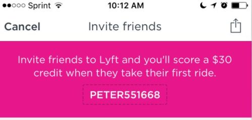
See what happens if you make half of your referees put in a referral code on your website, and let the other half automatically access their reward by clicking a link. You might think the latter option would automatically win because it’s easier. But it’s possible that a referral code using the advocate’s name, like Lyft uses, would drive more conversions by reminding the new customer that the referral is a favor from a friend.
14. Something Only You Can Provide
Many of our clients have won big with A/B tests that don’t fit neatly into a category applicable to every business, but instead tap into something special about their brand.
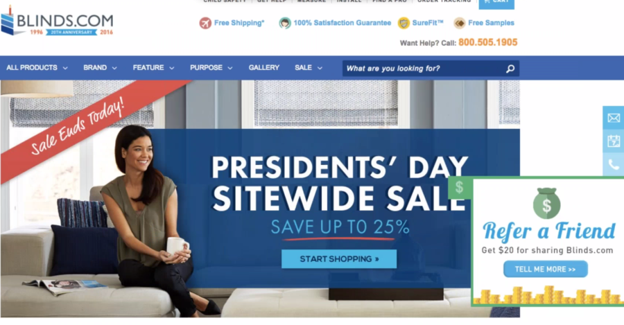
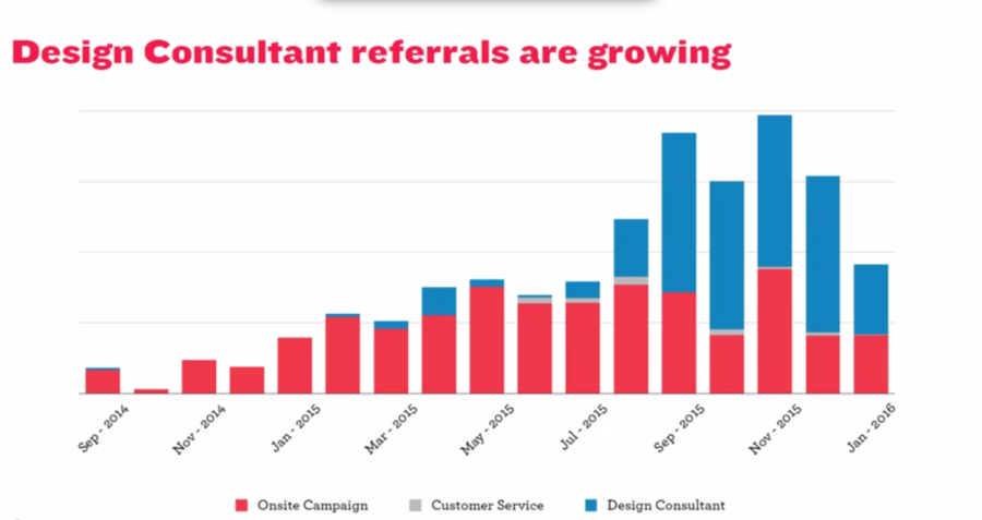
Take Blinds.com for example. A big part of their customer experience is working with one of their design consultants to find the perfect shades for any room. Originally, the company’s referral program didn’t take advantage of that. So they A/B tested a new version of the referral program in which advocates referred their friends to the specific consultant they worked with. The new program outpaced the old one by a mile, posting an 82% conversion rate.
Look for ways you can incorporate your unique brand and offerings into your referral marketing program, and then test them against a more conventional alternative. The results could be huge.
Test Your Way to Greatness
At the outset, referral marketing might seem intimidating because so much needs to happen for each referral to be successful. You need two people to complete multiple steps, and there are plenty of opportunities for them to give up.
But if you break that process down into individual, measurable parts, you can optimize each one. Keep testing and iterating to ensure that your referral program is continuously improving and converting at a higher rate.
