Your customer referral program can have all the essentials and still fail to convert leads. This can be because potential advocates or friends referred don’t take action.
Word of mouth is the primary factor behind 20-50% of purchasing decisions today. In fact, profits from referred customers will be at least 16% higher. That’s a lot of missed revenue if your referral marketing program isn’t converting.
Let’s look at the four common mistakes brands unwittingly make when creating advocate programs. We’ll also cover referral program ideas to solve these problems, and we’ll provide examples of those ideas in action.
As you’ll see, there is no silver bullet. Every brand will have to test what works and then adjust along the way, so we also include some examples of how to do that.
It’s not personal
Referral programs are impactful because they come from real people, not brands. For this reason, they have to feel genuine and personal. For example:
- Your language should speak to your target audience, so prompt them with a message in words they might actually use. Let them do the talking as well by allowing them to personalize their own message.
- Adding a picture of the advocate increases conversions by more than 3%.
- Customers typically recommend a brand because of a particular product. Apply this to your referral program and let them personalize their referrals based on a specific purchase.
Case study: Athleta
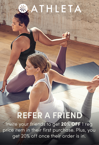
The Athleta referral program focuses on shared, real-life experiences rather than just monetary incentives. Their copy includes phrases like “Let’s work out together” to connect with positive experiences beyond just the purchase. This also implies that purchases fuel more of these experiences.
The Athleta ethos is about empowering women. They also use their referral program as an opportunity to communicate that; for example, by including their hashtag #PowerOfShe.
Case study: AAA
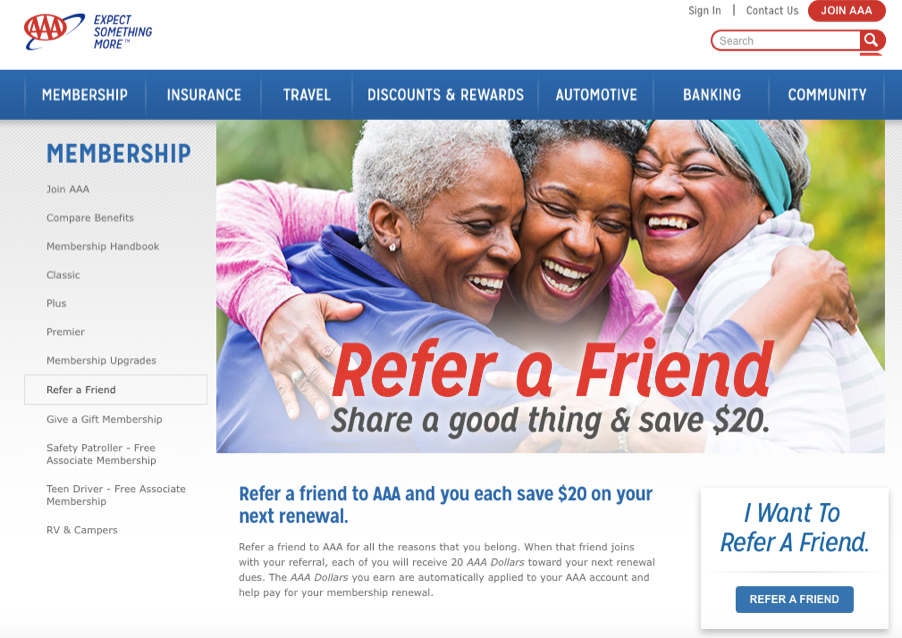
Employee referral programs are a great way to further personalize your brand. AAA Northern California, Nevada and Utah is a great reminder that employee advocates can be a brand’s most valuable asset.
AAA has built a strong relationship between its agents and customers over time. Their research showed that those relationships translate into customer advocates, so they focused on an agent referral program to drive referrals.
The company achieved incredible results by making its referral program truly personal. More than 95% of agents got on board, resulting in referrals that averaged a 20% higher premium per policy than other new business.Your referral program software can help you personalize even further. For example, it can report on the personalized messages that advocates share. Use those insights to adjust your own messaging.
The incentive isn’t right for your brand
Referral program incentives can include cash, account credit, discounts, coupons, gift cards, or something tangible, like swag or a prize.
Research by the University of Chicago found that incentives other than cash are 24% more effective. Yet the PayPal cash referral program was wildly successful in the company’s early days. Because PayPal is in the business of money, a cash referral system made sense for the brand.
Other research has found the opposite-that cash performs better than noncash incentives. So what’s a brand to believe? Whatever incentive you choose, it needs to be relevant to your audience, and to what you’re trying to communicate.
Case study: Union Privilege
Many union members know about their workplace benefits, but Union Privilege found that they didn’t know about other perks available through the Union Plus program-and they wanted to change that.
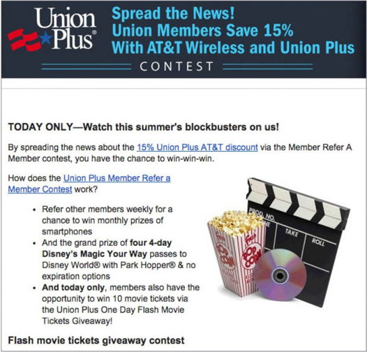
Union Privilege could have offered a membership discount as an incentive for their campaign. But the purpose of the referral program was to promote other lifestyle benefits of membership, so their idea was to give away similar prizes. They also knew that members were typically part of a family, which factored into the prizes they chose.
They created a competition that gave away grills, movie passes, and a grand prize trip for four to Disney World. As a result, they saw high engagement and a 93% increase in monthly subscribers online.
Case study: Leesa
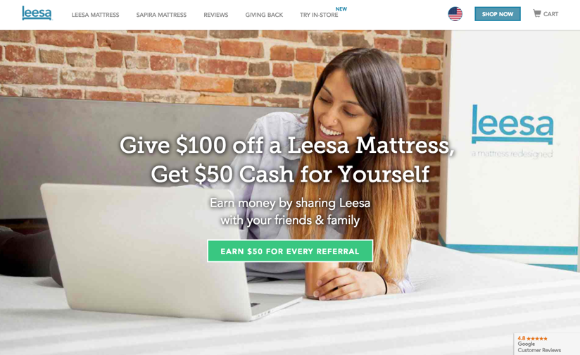
Leesa mattresses is another example of a well-planned incentive. The company recognized that a typical account credit or product discount would not motivate customers because they don’t buy mattresses often.
The brand chose direct cash incentives. Leesa also donates a mattress for every 10 sold, so the brand showed customers the impact of their purchases and referrals. This created an indirect social incentive.
More than 3,000 people have registered for the Leesa referral program. In addition, 33% of Leesa’s sales now come from referrals.
Use A/B testing to try different incentives, and messaging to see what resonates. For example, you may find that your target audience responds better to language about giving $25 to your friend than language about earning $25 for themselves.
You can also adjust your incentives based on customers’ past purchases. Notice that a top advocate always buys a particular brand? Offer them a discount for that particular brand.

Referral Marketing – The Best Practices You Need to Know
Written by veteran referral marketers, this guide will help you optimize your referral marketing program and supercharge growth.
Get the GuideThe user experience is too complicated
Even the best incentive can fall flat if there are too many barriers in the way. Texas Tech found that 83% of consumers are willing to refer after a positive experience-yet only 29% actually do.
The most well-intentioned brand advocate will give up if you make them jump through too many hoops. How many times have you tried to use a discount code, only to find that you lost it while shopping? Whether the code is long or short, shoppers will often give up if they can’t find it easily. Don’t use complex codes that are too clunky either.
Instead, your referral program should:
- Feature codes that are short and easy to remember
- Auto-apply your discount codes at checkout (your software should be able to do this for you)
- Have a dedicated landing page with all the information needed
- Not make users log in or create an account, if at all possible
Case study: Gusto
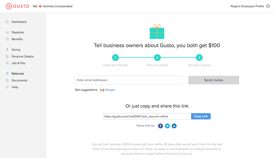
An important element of the user experience is how easy it is to send a referral. Gusto lets advocates use various social channels or send an email and even includes the Gmail prompt for Gmail users. The brand also shows the step-by-step process visually, so advocates know what to expect.
You can also check out more ways to create a seamless user experience.
While a variety of sharing options are typically useful, you don’t want to offer so many that they become overwhelming-especially on mobile phones. Test your referral program to see what works. You may find that the majority of referrals come from only one social media channel, for example.
You haven’t aligned with the user journey
Your brand referral program should be easy to find and visible everywhere, from your website to your app to in-store. But promoting it isn’t enough; it also needs to be in the right place.
Word-of-mouth programs are impactful closer to the time of purchase than traditional media-often within two weeks, according to the Word of Mouth Marketing Institute. The time immediately following a purchase is critical for ecommerce referral programs. In fact, we have found that customers are 16x more likely to share a referral if there is a call to action on the postpurchase pages.
However, that depends on your particular product. For example, Roku found that their referrals came 45 days after a new customer started streaming entertainment from their product. The Airbnb referral program found advocates often took action after hosting or traveling-not immediately after creating an account.
As with all marketing, your customer referral program should be strategic, based on your specific user journey. As you figure out what works for your brand, just ensure you don’t miss any key touchpoints. Thank advocates who take action, remind those who don’t, and keep them updated when their friends redeem referrals.
Case study: Zulily
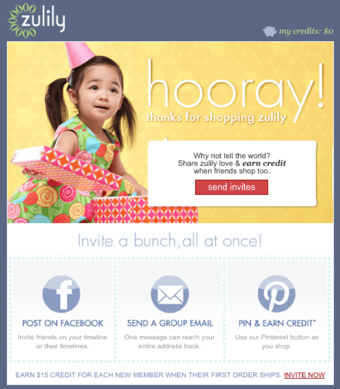
Here is an example of how Zulily takes advantage of the landing page following a purchase. The brand also generates excitement for the purchase itself.
Case study: Hanna Andersson
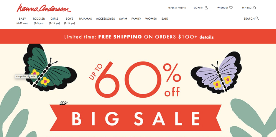
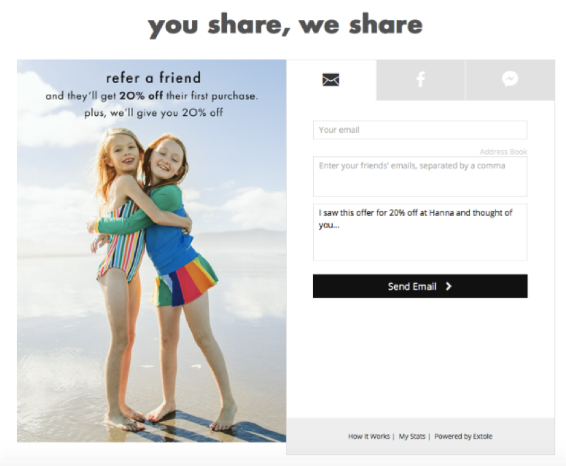
The website for Hanna Andersson includes the referral program in several key places:
- Top navigation on the desktop and mobile sites
- Global footer
- Postpurchase confirmation page
- Dedicated landing page
The brand also promotes the program in the catalog, Facebook posts and retargeting, Twitter, and email blasts. After two months, Hanna Andersson had already exceeded 25% of its annual goal for new customers.
A/B testing is particularly useful to discover the most impactful places to put your calls to action.
Next steps
If your referral program isn’t working, continue to test and adjust until you find what works for your brand. Remember, it’s worth it: When referred by a friend, people are 4x more likely to make a purchase.
