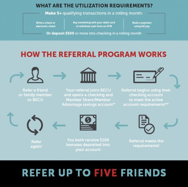
Once you launch a customer referral program, don’t let it run indefinitely without any changes. Just like you test ads and test your products, test your referral program regularly to ensure that it meets your customer acquisition goals.
This way, you can make improvements early on, especially if your customer referral program isn’t as effective as it used to be, or it launched with very little engagement.
Rest assured that testing doesn’t mean that the entire program needs to be overhauled. Rather, test components of the referral program to improve engagement and follow-through – for advocates and their referred customers.
Here are eight ways to test your referral program – along with insights on how they improve acquisition – to get you started.
1. Test the call-to-action (CTA) effectiveness
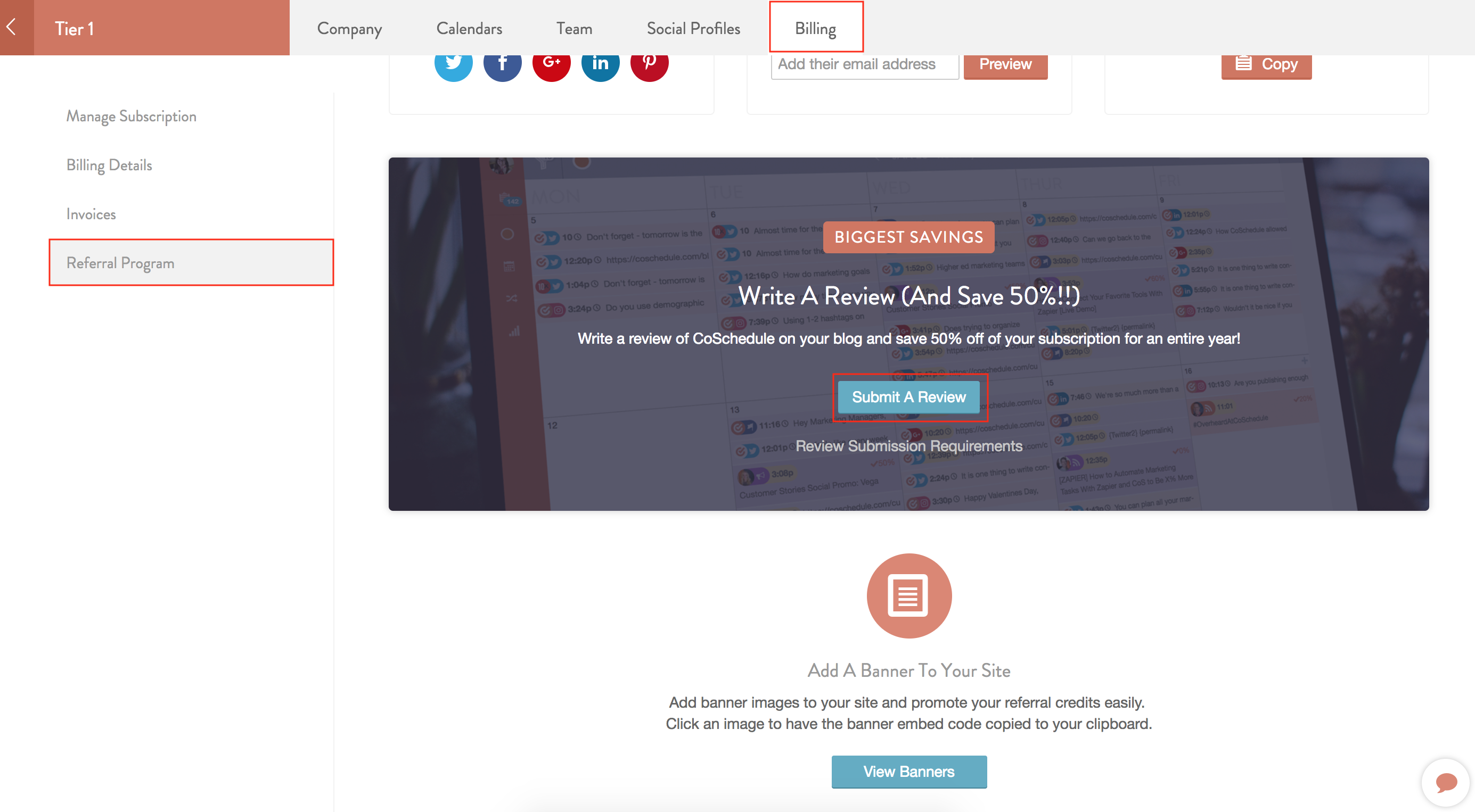
The content of your customer referral program is important, but the call-to-action (CTA) button is what spurs people to take action. It makes it clear to customers what the expected next steps are. Plus, it’s how you’re able to track engagement – the more clicks, the better.
To improve the effectiveness of your customer referral program, test the text, appearance, and location of your CTA button. The goal is to figure out what combination of these three factors leads to more advocates sharing the program.
First, experiment with the words you use on the CTA button. For example, use words like “Refer & Earn,” “Shop Now,” or “Start Earning.” Analyze the test results to see what type of text your audience is most responsive to. The clearer the CTA text is, the better the chance of them following through and sharing. For example, the “Shop Now” CTA can direct advocates to a products page where they can browse products they’re interested in. Knowing that they can save on these purchases encourages them to refer their friends and family.
Also, test CTA text depending on the type of customer you’re talking to. Test using a CTA like “Start Earning Now” for advocates who haven’t shared before and “Invite More Friends” for advocates who’ve shared before.
For the appearance of the CTA button, bold is better. Test different colors to make sure the CTA stands out. For example, use complementary colors – colors that when paired together appear brighter – to draw customers’ eyes to the button. So if your brand color is blue, test using an orange or yellow CTA button.
When it comes to the location of the CTA button, place it where eyes naturally look to on a screen. You can use a heatmap tool to analyze where people look to on your website.
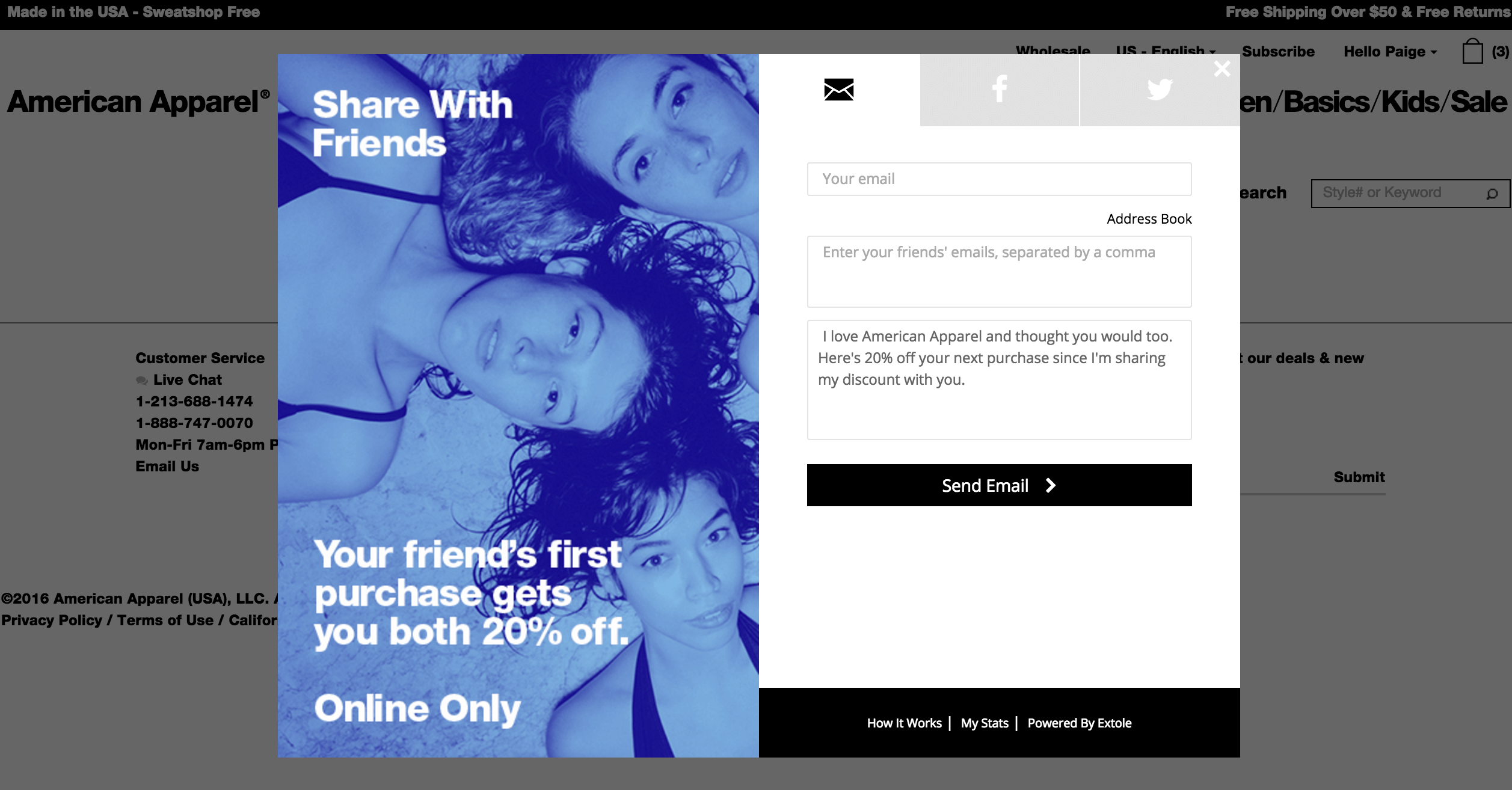
Test placing the CTA button at the end of a short message:
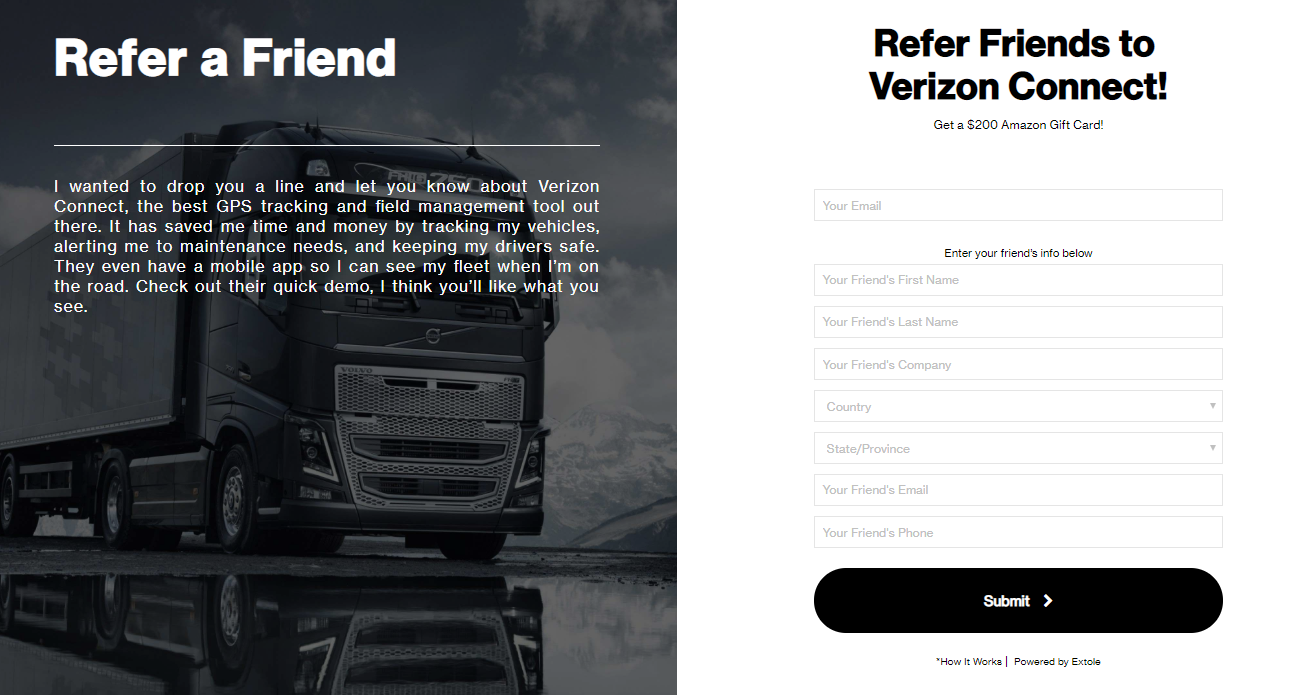
Test placing it in the middle or at the bottom of a customer referral program landing page:
At Extole, our users can choose where their advocates can share their referrals. For example, advocates can send emails, post on social media sites like Twitter and Facebook, or send referrals via Messenger. Test whether to use a custom CTA or use CTAs specific to each platform. Use “Send Email” for emailed referrals, “Share on Twitter” for tweeted referrals, and so on.
Key Takeaway
The right CTA makes the expected action clear and encourages people to click through. This applies to advocates and their referred customers. Make the CTA actionable and inspiring vs. something general like “Get Started,” which doesn’t quite explain what the next step is.
2. Test messaging types
Your ability to convey the benefits of your customer referral program will determine how successful it is. Simply saying advocates can earn lots might not be enough to convince them. Instead, link your referral to the value customers get from using your product. For example, if you sell stationery, use your message to tell advocates that they can save on a new planner that includes updated time management features.
Test how conversion changes based on the types of benefits you focus on. Start by testing whether the focus should be the added savings advocates get, the feeling of being seen as a trendsetter by their network, or even the option to earn rewards quicker.
Also, test how the program is communicated to advocates who have shared referrals in the past and those who haven’t. Much like the CTA you use, the wording you use for your advocates should be changed, so it’s relevant and based on how they use the program.
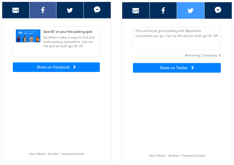
Finally, test how the message differs based on where the referral is being shared. For example, include a slightly longer message along with an image for links shared on Facebook and use hashtags and mentions for links shared on Twitter:This way, the program can be tailored based on the customer to maximize their chances of follow-through. It’s the same referral program; it’s just shared differently based on the audience.
Key Takeaway
Advocates who have shared your referral program with their network in the past are aware of the benefits and have experienced value. Use messaging to remind them that they can save more by using the referral program.
3. Test the look and feel of the sharing experience
65% of people are visual learners. The emotional response advocates get from your referral program influences whether or not they’ll follow through. Does your referral program landing page look organized and appealing? Are there paragraphs of content and few images? Have you used your brand colors? Are you using a modern theme your audience can relate to?
To ensure that your offer looks visually appealing, test how different images and colors impact engagement. Based on who your audience is, the images should reflect how this group uses your product.
In this Pottery Barn Kids example, rather than focusing on the types of products they sell, Pottery Barn Kids shows kids using the products:
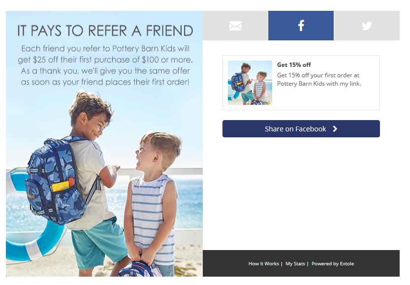
This approach also matches the look and feel of their website. It’s modern, clean, and shows kids enjoying the products. The website and referral program also use similar colors, which ties everything together to create a cohesive campaign:

Depending on your product, change the images you use at different times of the year. For example, the Pottery Barn Kids referral can be used during the back-to-school season. For the Christmas season, the image can change to kids hanging stockings sold by Pottery Barn Kids. Test different images to guide advocates and give them ideas on how to use the rewards they earn.
Our platform offers different layouts and designs for users to choose from. Plus, users have the option to build custom-sharing components. Include email and the social media networks where your advocates spend the most time.
Key Takeaway
Use images that show your product in action, are bright, and are relatable. Also, incorporate your brand colors to make the offer even more recognizable and appealing to advocates.
4. Test incentive types
Many customer referral programs offer the standard “give this and get that” rewards formula. This works well if your audience is motivated by monetary rewards – in fact 77% of people say they prefer cash incentives – but if your advocates aren’t using your program as much as you’d like, consider changing the type of incentive you offer.
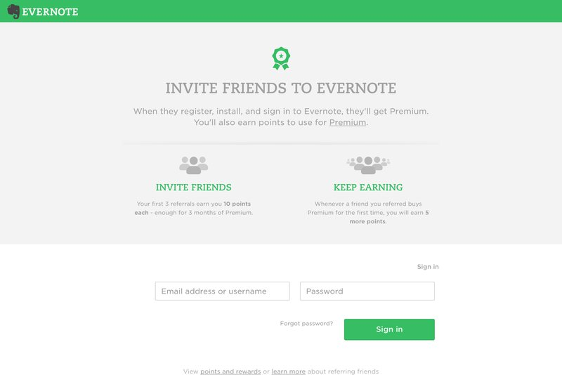
In addition to cash rewards, test whether gift cards, discounts, or points result in more referrals. For example, Evernote offers advocates points:
And Dollar Shave Club offers credits:
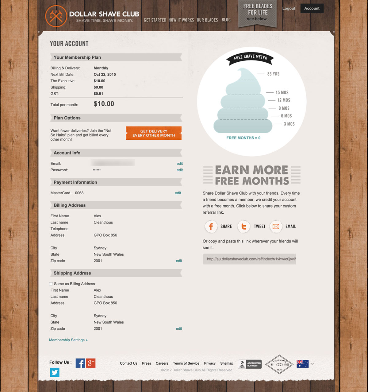
[Source]
The key here is to offer an incentive that matches your product or service. If you have a rewards program that lets customers earn and redeem points for future purchases, use a points system in your referral program to encourage sharing. The incentive should encourage advocates to share because they’ll get even more value from your product.
Something else to consider testing is the rewards incentives you offer advocates who haven’t shared before vs. those who’ve shared multiple times. For example, if you offer a points system, double the number of points advocates get when they share more than once. Test different increments to see which options result in the most shares.
Key Takeaway
Ask your audience for insight into the types of incentives they prefer, set up tests, and analyze which incentives resonate with them the most.
Also, test the types of incentives referred customers receive. Chances are they don’t have any prior exposure to your brand, so use their incentive as a way to encourage them to sign up or buy.

Referral Marketing – The Best Practices You Need to Know
Written by veteran referral marketers, this guide will help you optimize your referral marketing program and supercharge growth.
Click Here5. Test referral link placement
There are five main points along the customer journey: awareness, consideration, purchase, retention, and advocacy. You don’t have to wait until the final stage of the journey to introduce your referral program. Instead, test sharing the program earlier in the journey.
Keep in mind that interrupting the sales and order process could negatively impact conversion – for example, a prompt to share a referral during checkout might deter some customers from referring friends. They’re focused on completing the transaction first, not leaving the process to tell friends about it.
A few options for testing when to introduce your referral program include:
- On the order confirmation page after a purchase
- In the purchase confirmation email
- In an email request after a product review has been submitted
Key Takeaway
Finding the optimal place and time to encourage advocates will increase customer acquisition so that the sales process isn’t interrupted and customers are most likely to want to share a referral.
6. Test referred-customer onboarding
By the time a new customer makes it to the onboarding process, they’ve bought something and appreciate the value you offer. Use this time to reinforce their decision to buy from you by testing how you introduce the offer to them.
Some examples include:
- Use tooltips that guide new users through their dashboard and call out the referral program.
- Send an email to new customers with helpful hints on how to use the product or service. Include information about the referral program.
- Send an email with links to blog posts that help new customers learn how to successfully use the product. Include a link to a post about your referral program.
- When new users log on for the first time, use a pop-up to introduce the referral program.
- Send new customers an infographic that explains the referral program.
[Source]
The focus here should be to test ways to get newly referred customers familiar with your product or service and then encourage them to start sharing referrals as well.
Key Takeaway
Referred customers may or may not be aware of who you are and what you offer. Use the onboarding process to introduce yourself as well as to encourage them to share the referral program. Make it clear what benefits new customers can enjoy when they share.
7. Test email notifications and promotions
Unlike social media where you don’t technically own your followers – an algorithm change can either help grow your audience or hinder growth – your email list is your own. These are people who have decided that they want to hear from you and have given you permission to show up in their inbox.
Use email to test how you communicate your referral program. For example, optimize promotional email content, subject lines, and, in the case of advocate nurture emails, frequency.
Use your email list to remind customers about the referral program and the benefits of taking part – like this email from Refind, a platform that lets users find content that’s most relevant to them, which is short but uses current users to help build the audience:
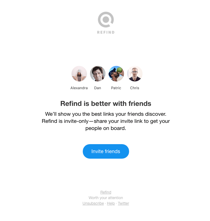
Use a tool like CoSchedule to test different subject lines and Mailchimp to test different email layouts. Also, test the best times to send emails. Studies show that the best times are early in the week and first thing in the morning because subscribers are more likely to open and read the content. Test this to see if this holds true for your subscribers as well.
Key Takeaway
Don’t be afraid to email your advocate subscribers. Segment your list to identify them and focus more on the benefits and value they get from referring vs. just promoting the referral program.
8. Test landing pages
Your website is like your virtual business card because it introduces you to your audience and makes it easy for them to contact you. It also gives visitors insights into exactly what you offer so that during the research stage of their customer journey, they can learn as much as possible about you.
Use your referral program landing page to test whether personalization results in a higher conversion than general landing pages. For example, test whether including the referrer’s name in a welcome message to their friend increases conversion:
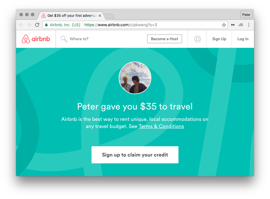
Also test different landing locations for referred customers to find where conversions are highest. For example, test whether referral links shared on the homepage, on product pages, on customer dashboards, or on custom referral program landing pages boost how often the referral program is shared.
Key Takeaway
Customers appreciate personalization, and it makes the referral offer more appealing and trustworthy. Referred customers are more likely to trust recommendations from people they know, so test what types of personalization you used. For example, share who made the referral or include the referred customer’s name in the referral message they receive.
Customer referral programs in action
The “test everything” ethos is vital for success. Your referral program has the potential to supercharge your customer acquisition efforts, so don’t settle for a mediocre program. Constantly look for ways to improve it so that it meets the needs of advocates and results in active sharing.
Treat your customer referral program like a program not like a project, so it drives more customer acquisition. Programs need to be measured, optimized, and expanded. If you’re interested in building an effective and scalable customer referral program, please contact us!


