Part 1. of How to Design your Mobile App for Referral covers the first half of referral—the sharing experience. Read it here.
According to a Google and Ipsos Media CT survey, 52% of people discover new apps through word-of-mouth. When we see an app that’s sent to us from a friend, we’re far more likely to try it out than one we stumble across on the App Store.
But app installs don’t mean much—most apps survive on your mobile phone only 24 hours before getting tossed out. While we all download tons of apps, the actual number that people use in the U.S. is around 26-27, according to a study by Nielsen. Half of these are native to the mobile OS.
When you design your application for mobile, you have to focus on engaging users at the right moments. Nailing down the second half of referral—the landing experience—is all about providing users with the optimal experience at the right point in time.
Where Do Friends Land?
Once you have the first half of the referral experience covered—how advocates share—the second half deals with actual conversion. Where does a user land if they receive a referral to a brand through a text, email, or Facebook?
This is the most difficult and important decision you need to make with your referral program because it determines how friends actually turn into paying customers. But the same problem remains as with the sharing experience—there isn’t one single path between how the referral message is sent and how that friend ends up converting.
The challenge for referral comes acutely from how mobile apps are downloaded from platforms like Apple’s App Store or Google Play. When a friend taps on a naked, regular link in a referral message on their phones, one of two things happens:
1. If the app is already installed on the friend’s phone, the friend is taken to the app.
They’re treated to the normal welcome screen of the app, rather than a referral landing page or message. They don’t know who referred them, or how to redeem their referral credit—and neither do you.
2. If the app isn’t installed on the friend’s phone, the friend is taken to the app store where they can download it.
This is great for getting installs and higher usage of your mobile app, but the context is stripped. The app store doesn’t tell app that the friend was referred, which means that they can’t redeem the offer, and you can’t reward your advocates.
People make split-second decisions over how they engage with your brand and your company online. With your refer-a-friend program, you want to remind people where they came from, that they found you because of their personal connection with an existing customer in order to build a stronger connection moving forward. With your mobile app, this means that you have to work around the App Store. This is even more true if you want greater visibility into your analytics—which you need to optimize in your referral program.
You need to design the friend landing experience to tackle these issues. There are basically two options available to you: (1) deep link to the landing page, and (2) create an account on landing sign-up page. Each presents a different solution for working around these issues
Deep Link to the Landing Page
When new users are greeted by a generic welcome screen in your app, they’re cut off from where they came from—the referral message that a friend sent.
The friend taps on a referral link received via SMS, and they install the app. If he wants to apply the referral code, he has to create a login, navigate back to the text message, and copy-paste the referral code back into your app. What you need to understand is that you’re already asking your users to do a lot in installing your app. Giving the process more steps will ultimately drive them away.
If your goal is to drive users into your app, use a deep-linker like Yozio or Branch to take them to a specific referral landing page following the install. When a friend clicks on a shortened URL, the deep linking service takes a fingerprint off the friend’s browser, and compares it with any information they might have on them. This information is then relayed back to the app, all within a couple hundred milliseconds.

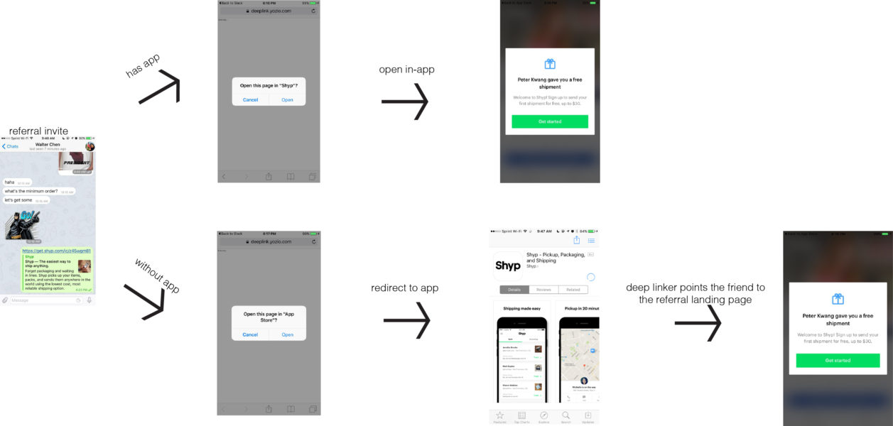
Shyp is a great example of a company that only uses a deep linker for the friend’s landing page. Shyp wants to get as many friends as possible inside the app—that’s the only way they can really get any value from the service.
When a friend receives a referral invite, they click on it. If they don’t have the app installed, they’re directed to install the application, and they’re greeted with a personalized welcome: “Peter gave you a free shipment.”
There are several advantages to choosing this route:
- Higher app installs. If your company operates primarily through your mobile app, and that’s how you provide core functionality, you want to drive them inside of your app as soon as possible. Once friends have your app installed, you can build the relationship further through push notifications and triggered emails.
- Deep linking allows you to get more granular with your analytics data—especially when it comes to measuring the impact of dark social. It’s not 100% accurate, but you can get a lot more information—trace specific UTM parameters, the number of app installs associated with a specific referral link, and more.
- Richer context. With your mobile app, things have to be relevant to users for where they came from and where they’re going to. A friend greeted by a generic welcome page after the app install is a missed opportunity.
There’s a couple of drawbacks to deep linking. The technology behind deep linking doesn’t work with 100% accuracy—and it doesn’t always work seamlessly across social. Instagram, for example, doesn’t allow users to post links. Also, most deep linking services like Yozio or Branch.io forget fingerprints after several hours. This means that if a friend downloads the app, but doesn’t open it immediately,the referral connection will be lost you won’t be able to reward the advocate.
Takeaway: If all you want to do is drive new users inside of your app and give credit to advocates, you’re best off pointing referred friends to a specific referral landing-page in-app through deep linking.
Create an Account on Landing Sign-Up Page
Shyp is largely a mobile app, so it makes sense that their friend landing experience drives users to install the app. However, you don’t always want to drive users to install the app from the first moment. If it’s not the right moment, it’s a great way to get your app tossed into the dustbin. 84% of consumers are unwilling to try an app again after two attempts.
What’s may be more important than driving up the number of downloads or installs is connecting your customers with the right context at every point in their experience. If you just want to get to know the customer a bit more, the alternative is to direct friends to sign-up for an account on your mobile web page. You can build a lightbox pop-up that shows them the details of the referral program and provide them with a text code to apply at checkout.
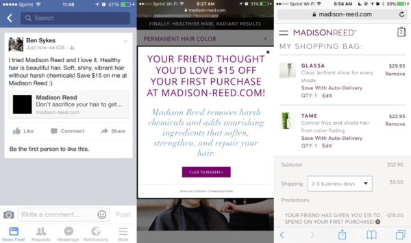
Madison Reed is a good example of this—friends that click on a referral invite are taken to a specific landing page and then directed to create an account. Once they click through, The referral code is automatically applied to their account, which they can then see in the shopping cart.

The referred friend doesn’t necessarily make a purchase instantly after clicking—she might poke around the web store, add a couple items to her shopping cart, and then leave. But Madison Reed now has her name and email and can reach out further and build a relationship.
- You can have 100% certainty in who the customer is. Once they’ve signed up for an account online, you can then match that profile to your CRM, allowing you to keep tabs on behavior across desktop and mobile—including your web app and your mobile app. You can associate the created account with the referral invite with complete accuracy.
- You don’t force users inside your app just for the sake of it. The worst thing you can do is drive your users to your app just for the sake of it—if they can’t find the value in it from the get-go, they’ll delete it. By making account creation the first part of the friend journey, you avoid this problem.
- Once you have the friend’s basic contact information, you can nurture them further. You can set a deep linking cookie on their browser for when they download your mobile app. You can send them an email with a referral code of their own to share and you can send them an email to download your app. The information you have on the friend allows you to reach out with richer messaging.
By directing friends to create an account, you’re not forcing them into the app to get the referral credit. They can sign-up, and browse your site at their leisure—but you can still give advocates their due.
Takeaway: If you need the ability to personalize the referral experience across devices, it’s best to direct users to create an account after the referral invite. When a friend signs-up for an account, you don’t need to make them download your mobile app immediately, because you have enough information to start a conversation.
Design for Web and Mobile
When you design your mobile app for referral, it’s easy to forget about the desktop—desktop isn’t a buzz-worthy topic to talk about right now. Extole’s internal research has shown that while 39% of referral messages are viewed on mobile, 82% of advocates still share from their desktops.
If your company operates across devices, and cross-channel, your users might be online on their phones or on their desktops. You can’t predict where a customer will be at any given point in time, so your referral program needs to be prepared for both situations.
The most important thing when it comes to designing for referral is to match the user experience with user intent. At the end of the day, it’s not about how many new friends download your app. It’s about how many use it to get the experience they want.


